Sunday, November 16, 2008
Artist Study: Pierre Bonnard
Pierre Bonnard was born on 0October 3 1867 in France. His father was an official in the French ministry of War. He pressured Bonnard to study Law which he did for a short period of time. He also took art classes and in 1891 showed his first works. he was also a print maker. His paintings have a lot of detail and use brilliant colors.Many pastels and bright colors were used in the majority of his painting giving them a light and optimistic flair. even his darker and more mysterious paintings used great color and light creating a unique style and mood in the paintings.He continued to paint and show his work until his death in 1947. His work is still recognized today world wide.
Wednesday, November 12, 2008
Progress on painting
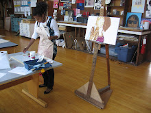
This past week i have been i have been continuing to build up the painting. I have realized that this painting is going to improve with the more details that I add. When I added the yellow bow on the box the painting started to look more finished and polished. I have also started to add flowers in to my fabric. I have also learned by experimenting that I will have to make the flowers individually to make it look like it is on fabric. Hopefully I will finish this piece this week !
Thursday, October 30, 2008
Balthus


An artist that relates to teh work that i have been doing is Balthus. he is famous for doing portraits. He is a french painter that was born in 1901. most of his work constists of paintings of people in differnt angles. this is intersting to me because the positions that the people are in are difficlut to paint. these images are also bold. he also uses color in a way that really enchances the work. alot of the art doesnt have bold colors but there is alot of warmth in the paint that draws your eye to the people in the portrait and not the surroundings. Balthus died in Feburary 2001 at the age of 92.
New Day New Painting
This week i have started a painting of a still life. In the still life their are bottles of different shape and color and a dark blue box. There is also a printed fabric surrounding everything. I have started by painting bold shapes in the colors that the objects are. I have also started putting highlights and shadows in the bottles and fabric. The Fabric is going to challenging because there are so many folds and many different colors. At this point i am feeling good about this new painting.
What I Have Been Doing
This semester i have been working on a portrait on my sister and myself. This is the first portrait that i have ever done and there is not just 1 but 2 faces!! I started the process by painting the major bold shapes in basic colors to make sure that i work from general to specific. the placement of the parts of the face was difficult to execute. I had to move the eyes about three times until they were at the right distance from the nose and at the right angle. I also learned a lot about color. Skin color is hard to do because you have to now what hue to use in order to make the features of a person. I have never looked at a picture of myself so closely. I learned that my sister has red undertones when mine are more orange. At times i got very frustrated with the painting. making the nose and eyelids are difficult because they are small things that are difficult to make the right color and give the correct placement. They also make the picture look so much better. Small changes can be a big deal in art. I have yet to tackle the mouth and the teeth which is going to be challenging. Now i am at a stopping point where you can tell that the painting is of my sister and I. The entire canvas is covered in paint and I'm sure that i will be able to go back to it in a few weeks with a fresh eye and be able to complete a beautiful piece of art.
Wednesday, October 15, 2008
Mid Term Reflection
This year my large painting of two faces has been most challenging. this is the first time that i am painting an entire face, let alone two. faces in general are hard to paint and these ones are really big and at an awkward angle.I am progressing in my color mixing this shows in the noses of the people. I also have to spend time observing areas on my face in a mirror and in a picture. this is helping me improve on my observation skills. This improvement is shown in the proportions of The people and their body positions.
Today we can use techniques that were discovered and used my earlier artist and build upon them. In my painting i had to look at Renaissance looking paintings to figure out how to create a nose. it is important to appreciate the work that they did.
Today we can use techniques that were discovered and used my earlier artist and build upon them. In my painting i had to look at Renaissance looking paintings to figure out how to create a nose. it is important to appreciate the work that they did.
Wednesday, October 1, 2008
Famous Paintings

The painting that I found to be most interesting was water lilies by Claude Monet who is from France.. In terms of texture there is a blurry feel to the painting. There are no defined lines and all of the water lilies have a soft and smooth texture. There are also many highlights and shadows in the picture that add texture to the water and show that shadows from the trees and everything from the surroundings. The composition of the painting is also interesting because there is nothing in the middle of the painting and all of the sides are filled with objects. To me the painting is showing a calm place. This piece of art is important to the world of art and to me because the style is so different. And art is all about being original and showing a new point of view.
Wednesday, September 24, 2008
Homework#4
In the painting of peaches and silver goblet the bright white highlights are used to make the smooth, solid texture of the cup. Also the edges of the peach are fuzzy giving them a softer texture. The painting with the fish and jars also use highlights to create texture. The lettuce and the cheese and other vegetables have a lot of the same color in different shades making them appear to be round and smooth. The glass of the container and the silver part of the container have white highlights making them look hard and shiny. In the painting of the chair the brush strokes were used to create the texture of the chair. You can see all the strokes of color and the direction of the strokes giving it a great texture. In the flower paintings different hues of the same color were used to create a smooth texture on all of the flower petals.
a painting i remember
The painting that i will never forget is by Hopkins. It was of a dinner late at night with only one man in it. It was night time in the painting and the lights were on inside of the dinner. The inside of the dinner seemed to glow from the painting. The painting stuck with me because the image was powerful and the colors were so bold. The style of the painting was also original and different from any painting that i had ever seen. No other painting that i have seen has had that much style even from its time period. I hope one day that i can create my own style that is just as powerful.
Reflections on Studies in smallness

doing the small paintings were the first time that i had painted since last year. i was happy to be painting again. the painting of an apple went well i remembered how to look at the object and not see an apple i just focused on the colors and shapes that i saw and eventually created an apple. for the shell it was hard for me to make the roundness of the shell.. which got frustrating. i liked starting on a small scale to make getting back in to painting easy and it was a good way to refresh my skills.
Thursday, September 18, 2008
homework#2
The composition of a picture can do a lot for a picture. In the paining custard cascade the close up of the picture makes the cakes look more fluffy. It is also interesting because it makes something so small like frosting on a cake, something often over looked look beautiful and important. In the painting three puppies the proportions add interest to the painting. The dogs are so small and the bowl so big so that the eyes move from the dogs to the corner of the table. There is also symmetry in the picture because of the three dogs and three cups. The still life of the watermelon follows the rules of three because there is an item in every third of the painting creating small amounts of negative space and adds interest to the painting. In the paining of the lemons there is a lot of negative space . the rhythm of the painting also moves the persons eyes horizontally across the painting.
Wednesday, September 10, 2008
Homework 1
In the painting by Van gough and Morandi two completely different styles were used to crate eqaually successful results. Vangough uses bright hues and warm colors to make the images in his paintigs pop. This was a good choice because his subject matter is living and the lively colors mak it look more.. alive. In the painitng witht the flowers Van Gough also uses complementary colors to draw the eye to the plant. He also uses many colors in the petals of his flowers adding depth to the painting. These colors also evoke warma and cozy feeling to the viewer.
The painting by Morandi uses many shades of white in his paintings. Though white can be looked at as a boring and bland color if you look closely you can see the warmer and cooler tones revealing more colors than just plain white. This was also a good chice beacause the subject matter is inamimate. The colors give off a isolated and silent mood adding intrest to the painting.
The painting by Morandi uses many shades of white in his paintings. Though white can be looked at as a boring and bland color if you look closely you can see the warmer and cooler tones revealing more colors than just plain white. This was also a good chice beacause the subject matter is inamimate. The colors give off a isolated and silent mood adding intrest to the painting.
Wednesday, September 3, 2008
my skills as an artist
in art i am confident with my abilities to come up with ideas. i am also good at mixing colors and using them to portray depth, feelings, and textures. i struggle with having the end result look as close to real or my vision as possible. hopefully i will be able to create more realistic looking art by the end of the term.
why im taking oil painting
I'm taking oil painting because i took the class last year and i had a lot of fun. it took a while for me to understand how to use my brush and colors but eventually i got the hang of it and love to paint!!! at first i thought the coarse would be challenging and boring but eventually i started to have fun and would like to continue painting forever.
Subscribe to:
Comments (Atom)